Brandpulse creates new overall appearance for Hugo Boss
The Boss logo, unchanged since the 1970s, had a high recognition value worldwide. Recently, however, the brand reached its limits in times of digital-first communication and thus fell out of sight, especially among younger target groups. Brandpulse modernized the branding of both brands as part of a global brand refresh project. The strategic goal of Hugo Boss is [...]
The post Brandpulse creates new overall appearance for Hugo Boss appeared first on Advertising week m&k.


 The Boss logo, which has remained unchanged since the 1970s, had a high recognition value worldwide. Recently, however, the brand reached its limits in times of digital-first communication and thus lost its visibility, especially among younger target groups. Brandpulse modernized the branding of both brands as part of a global brand refresh project. Hugo Boss' strategic goal is clear: in the coming years, the potential of the brands is to be exploited to a greater extent. The modernized brand appearance should also contribute to this: Brandpulse renewed the overall appearance of the brands with a concise look and feel with the premise of a strong, self-confident impact according to the motto "Be Bold". The new brand image is primarily intended to gain relevance, appeal more specifically to younger generations and position the two brands Boss and Hugo unmistakably with their own lifestyle stories.
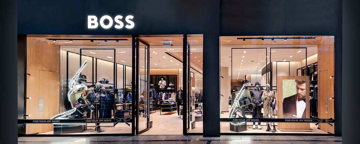
Simplified brand structure
With a clear differentiation of the Boss and Hugo brands and the corporate brand Hugo Boss, the basis for a clearer positioning was created: The brand structure focuses on Hugo Boss as a corporate and platform brand on the one hand, and Boss and Hugo as lifestyle brands on the other.Modernized logo
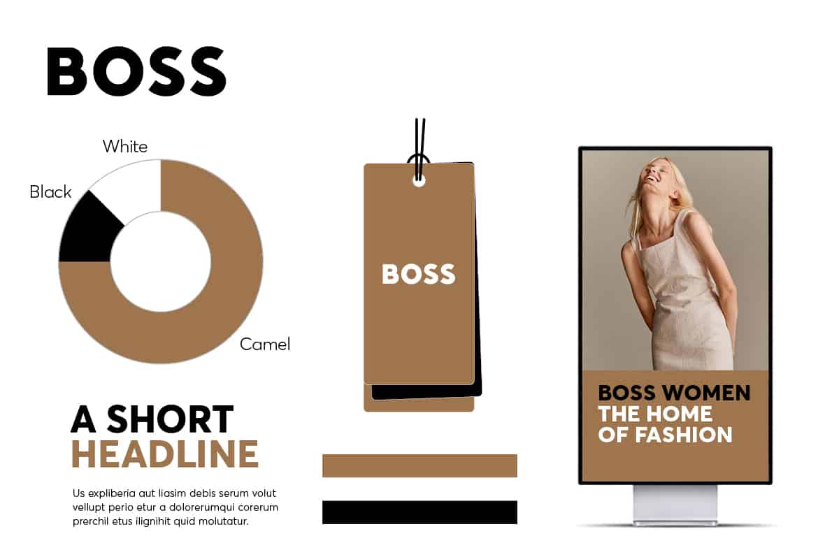
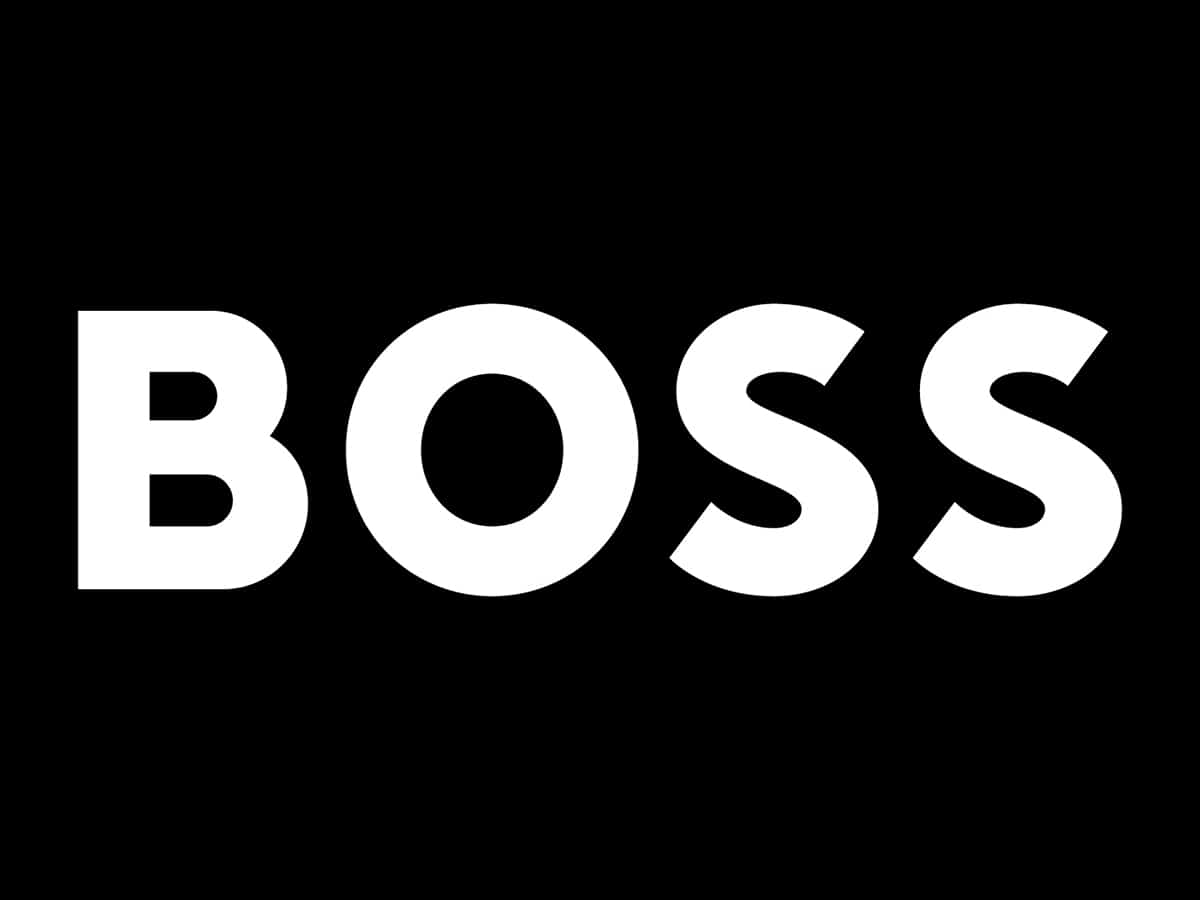
The Boss logo was given a facelift and now appears sans serif and concise. The previously used corporate anchor Hugo Boss and the logos Boss and Hugo will be dispensed with in the future. The more modern logo appearance represents a contemporary upgrade for a future-oriented fashion brand through optimal usability in digital applications as well.

Color as a strong brand design element
The use of color in the previous brand design was sharpened by a clear color concept with the colors black, white and camel with different color inserts depending on the Boss brand's menswear and womenswear. Thus, the main color camel characterizes the appearance of the Boss brand in womenswear, while black is the dominant color of the Boss appearance in menswear. The modernized branding colour concept with white and red for Hugo is also intended to create differentiation and clarity. Overall, the brands now present themselves as much more striking, self-confident and strong and are therefore ready to conquer the fashion world with renewed vigor.